
This rule, Guy Kawasaki,, is a method to optimize three elements: the number of presentation slides, presentation time, and font size. Now, let me introduce how this rule can help you create an effective presentation.
The 10/20/30 Rule for Making Presentations Clear and Concise
The 10/20/30 rule includes the following three principles. This rule makes presentations clear and concise, and helps maintain the audience's attention.
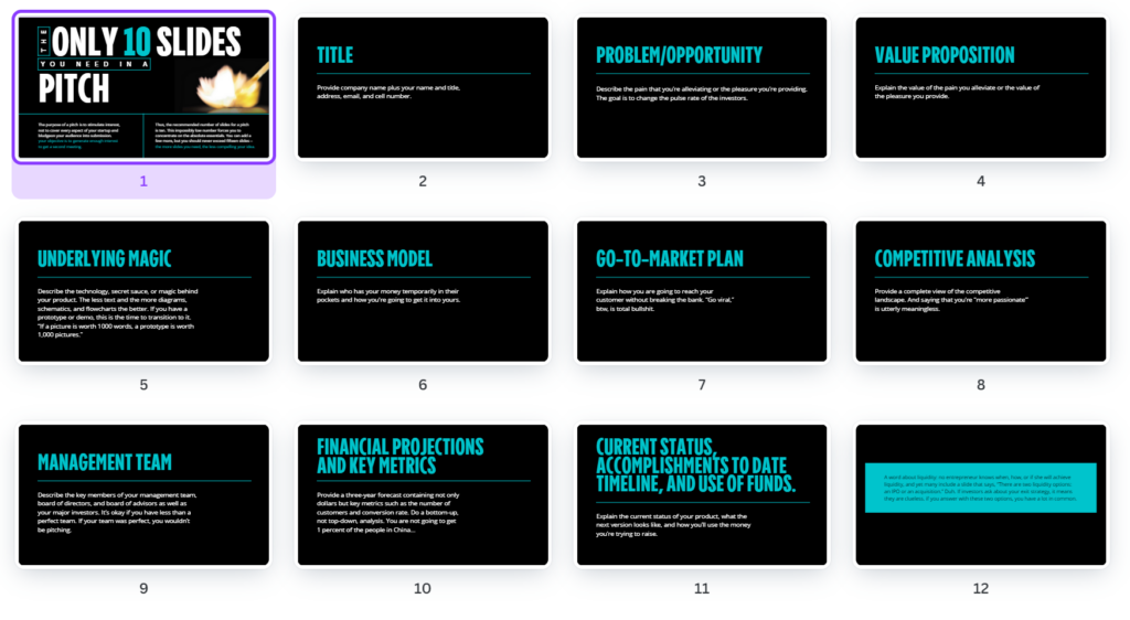
1. 10 slides
Presentation slides should be limited to a maximum of 10. This helps the audience digest the information without being overloaded. A presentation consisting of 10 slides allows you to focus on the core message, exclude unnecessary information, and emphasize important content.
2. 20-minute presentation
Your presentation should not exceed 20 minutes. This is crucial for maintaining the audience's attention. Since the average person's attention span is approximately 20 minutes, exceeding this time can cause the audience's interest to waver. Delivering key points within 20 minutes requires time management and efficient communication skills. Try practicing your presentation speed by using the timer feature in Presenter Notes on Google Slides.
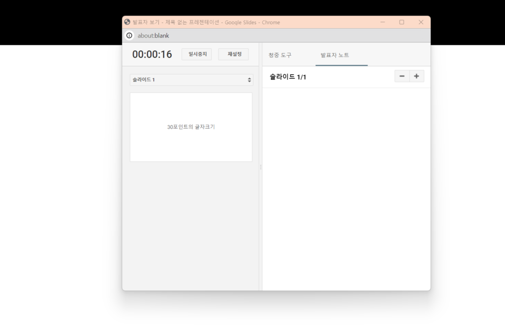
Learn how to use Google Slides presenter notes
3. 30-point font size
Text on slides should be written in a font size of at least 30 points. This enhances readability and maximizes the visual impact of the presentation. Small fonts are difficult for an audience from a distance to read, and important messages may not be conveyed. Large fonts emphasize key information and provide visual clarity. Increasing the font size naturally reduces the amount of text per slide, allowing you to effectively deliver your message alongside visual elements.

This principle became widespread after Guy Kawasaki released it via a template on Kanba in 2005. Even now, 20 years later, it is still used like a textbook. He released the template for free to support startups in creating successful presentation materials. Since it contains only the essential storylines, I recommend that CEOs starting to draft a pitch deck download it and use it to organize their flow.
📍 Download Template (Canva ID required)
Of course, not every presentation can be solved by a single rule. Since each presentation differs depending on the goal, audience, and situation, a flexible approach is required. Consider the 10/20/30 rule as a framework to help you get started, and imagine and reconstruct the moments that fit your company's specific situation. Nothing increases persuasiveness more than materials that concisely capture the presenter's sincerity, rather than flashy slides filled with flowery language.
Create presentations for business growth with Team PPT.